

A dynamic, immersive learning experience putting students at the heart of a simulated emergency.
We rely on a vast, interconnected network of infrastructure every day—from food and water to power, transport and communications. But who protects the systems we depend on when things go wrong?
This is the role of resilience professionals: anticipating threats, assessing risks and making critical decisions to keep essential infrastructure running.
It provided an ideal real-world scenario for challenging students to step outside the classroom and put their problem-solving and critical-thinking skills into practice.
We helped The National Digital Twin Programme – run by His Majesty’s Government – work with teams of students to take the lead in the control room during a simulated flooding incident situation.
The Brief
The challenge was to bring the realities of emergency resilience to life for a group of students, transforming a traditional learning experience into something immersive, engaging and unpredictable.
The experience needed to place students at the centre of a simulated flooding emergency, requiring them to assess information, identify misinformation, prioritise competing demands and make decisions under pressure. It needed to feel authentic enough to create a sense of urgency, while remaining accessible and engaging for a young audience.
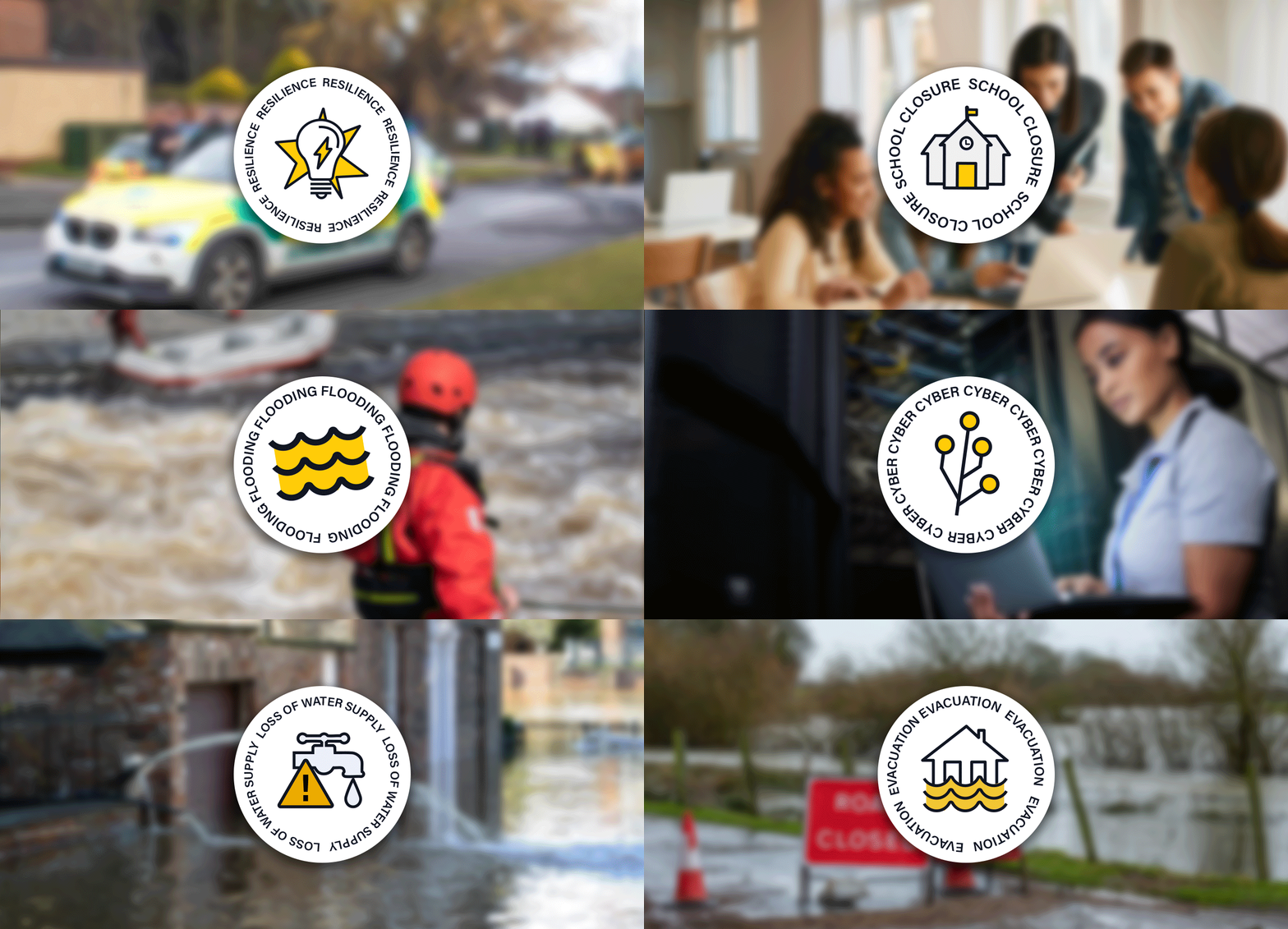
A strong visual identity was needed to unite the experience across multiple touchpoints—from pre-event communications and physical materials to the digital platform and multimedia content—creating a cohesive world that students could step into.
The Visual Identity
The Challenge needed a bold, engaging identity which would appeal to a young audience whilst being flexible enough to work across a range of mediums. The brand visuals also needed to be clear and accessible, working well within a learning environment.
During the research and development phase, we explored the brands and visual styles that resonated with the young target audience, alongside graphics in emergency and news communications. This helped shape a visual direction that felt both credible and engaging. Drawing on the behavioural science principle of ‘gamification’, we developed the primary logo with the visual language of an achievement badge, reinforcing the idea of the challenge and giving participants a sense of progression and accomplishment.
The colour palette utilises the Deep Navy from the National Digital Twins' palette as one of it's primary colours, alongside a striking yellow, creating a strong contrast within the brand and resembling the colours of emergency services.



The Learning
The design challenge was to create an experience that felt authentic to the pressure and uncertainty of a real emergency, rather than following the predictable structure of a traditional learning experience.
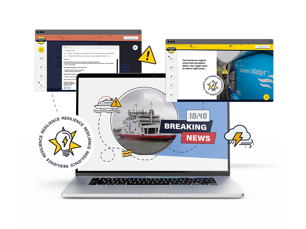
From a visual and UX perspective, this meant deliberately introducing complexity and unpredictability. Information was presented through a mixture of conflicting messages, distractions, misinformation and dense content, requiring participants to navigate the experience carefully and identify what was credible and important.
Every design decision was intended to reinforce the sense of urgency and ambiguity, encouraging students to apply critical thinking, question the information presented to them and make informed decisions under pressure.


“You enabled the students to experience what it’s like for us resilience professionals when dealing with incidents in real life… at times it felt real even to me! The programme was designed to deliver the different scenario injects in a unique, immersive way.”
Lisa Scovell-Strickland
Resilience Coordinator (Emergency Planning),
Isle of Wight Council
